I shaped Zalando's internal developer experience strategy as the sole product designer for the Builder Platform portal 'Sunrise' — unifying fragmented tools into a cohesive platform that 1,800+ engineers, data scientists, and product managers relied on daily, including during Cyber Week, Zalando's highest-stakes operational event.
My Role
- • Lead UX design process for the Builder Platform, ensuring user-centered design approaches throughout the product lifecycle
- • Collaborate with PMs, Engineers, and cross-functional teams to improve user experience in Builder Infrastructure
- • Conduct user research to understand builder needs, pain points, and workflows
- • Market and promote the product to increase awareness of the platform capabilities
Built on Backstage: Designing Within an Open-Source Ecosystem
Sunrise was built on Backstage, Spotify's open-source developer portal framework. This meant designing within the constraints and opportunities of an open-source ecosystem — working with community-contributed plugins, contributing UX patterns that aligned with Backstage's extensibility model, and making design decisions that balanced Zalando's specific needs with the platform's open-source conventions.
Designing for an open-source platform shaped my approach in important ways:
- • Extensibility over customization — Designs had to work within Backstage's plugin architecture, so I focused on composable patterns that could accommodate community plugins without breaking the experience
- • Transparency and community feedback — Design decisions were shared openly with stakeholders who also participated in the broader Backstage community, requiring clear rationale and alignment with open-source principles
- • Contributing patterns back — Navigation structures, creation flows, and deployment visibility patterns I designed were developed with reusability in mind, following Backstage's design conventions so they could inform the broader ecosystem
Builders Couldn't Predict the Outcome of Their Own Actions
Through builder satisfaction surveys, developer console surveys, and user interviews, a pattern emerged: the platform's real problem wasn't poor navigation or missing features. Builders couldn't predict what would happen when they took action — deploying code, creating resources, or navigating between tools felt uncertain and risky.
Surface-level discoverability fixes wouldn't solve this. I needed to redesign the experience around workflow transparency and confidence — so builders could see where they were, understand what would happen next, and trust the outcome. This strategic reframing shaped every initiative I led across the platform.
Theme 1: Workflow Transparency
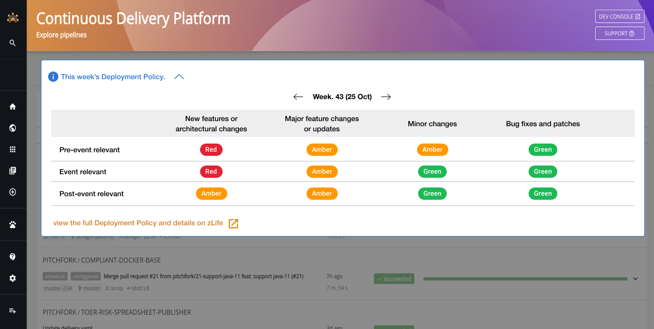
Continuous Deployment Pipeline Redesign
Pipeline state was opaque, failure points were invisible, and recovering from errors required tribal knowledge. Through contextual inquiry with 8 engineers across different teams, I identified that the core anxiety wasn't about deployment failures — it was about not knowing if a failure had occurred until it was too late.
I redesigned the CDP experience to surface real-time status at every step, provide actionable failure states with clear recovery paths, and show deployment confidence indicators. The redesign transformed deployment from a "fire and pray" operation into a guided, transparent workflow.
Domain Discovery & Organization
Builders couldn't find existing domains or understand organizational structure, leading to duplicated efforts and cross-team confusion. I designed intuitive discovery workflows that surfaced domain ownership, relationships, and dependencies — making the platform's organizational structure visible and navigable.
Theme 2: Scaling the Platform Through Unified Patterns
Sunrise had grown organically — each team shipped their own tools, navigation patterns, and creation flows independently. For individual teams, this made sense. But at platform scale, it created compounding costs: longer onboarding, duplicated engineering effort, and builders who struggled to transfer knowledge between tools. The business needed the platform to scale without linearly scaling support and training overhead. Every design decision below was shaped by this tension between team autonomy and platform coherence.
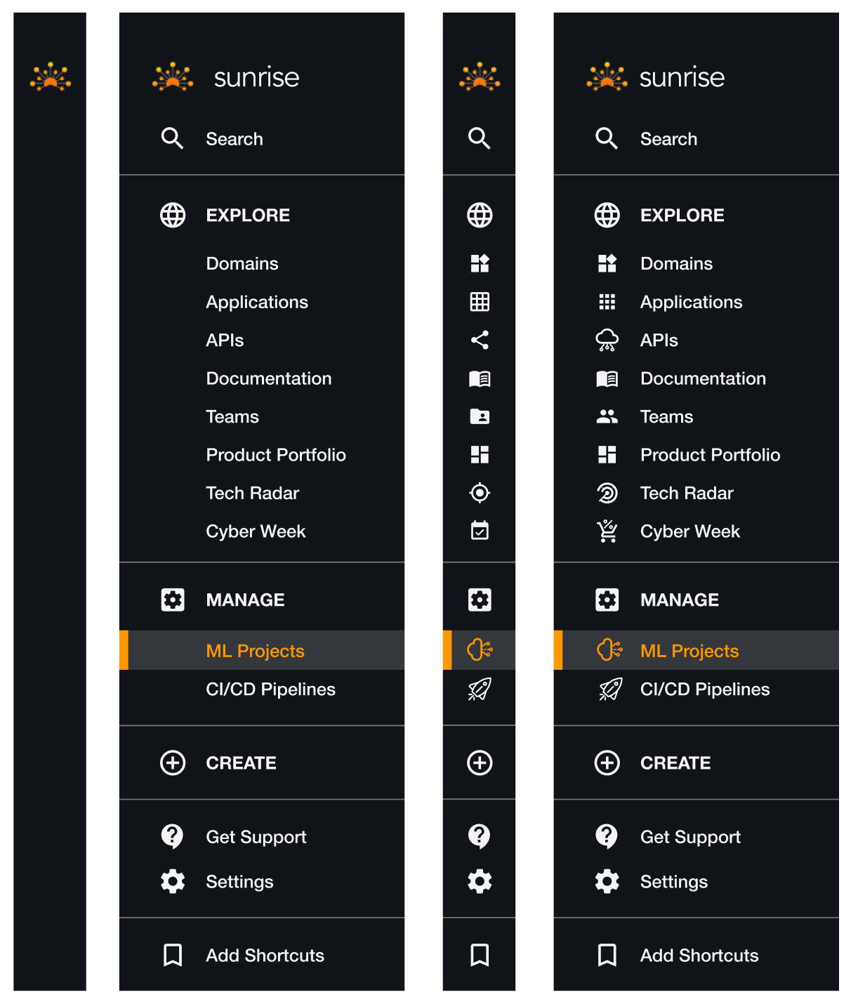
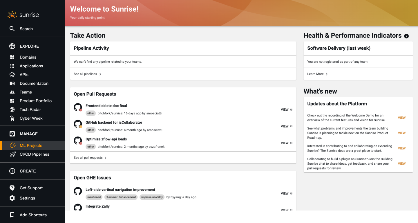
Platform Navigation Redesign
The problem
With 20+ tools, the horizontal navigation bar couldn't scale. Builder surveys ranked "discoverability" as the #1 pain point. New team members reported a 2-3 week learning curve just to find the tools they needed — a direct drag on onboarding speed and developer productivity.
Research & approach
I ran card sorting sessions with 12 builders across different roles, analyzed navigation analytics to understand actual usage patterns, and benchmarked internal developer platforms at other tech companies. We tested two concepts: a mega-menu and a persistent left-side vertical navigation.
The design decision
The mega-menu scored higher in first-impression usability tests, but I pushed for the left-side nav. The business rationale: analytics showed builders used the platform for extended sessions (avg. 45 min per session). A persistent nav reduced context-switching cognitive load for power users — the people generating the most value on the platform. The trade-off was less content real estate, mitigated by a collapsible sidebar.
Unified Creation Experience
The problem
Each team had built custom creation wizards for their specific resource types. Builders who worked across multiple tools had to relearn the creation flow every time — different step orders, different field labels, different validation patterns. This fragmentation increased error rates and support tickets.
The design decision
Teams resisted standardization — each wanted their custom wizard optimized for their specific use case. I pushed for a unified pattern that balanced consistency with flexibility: a shared step structure (Name → Configure → Review) with pluggable configuration panels per resource type. The business rationale: a consistent creation pattern meant builders learned the flow once and recognized it everywhere, reducing the marginal cost of adopting each new tool to near zero. This was critical for Zalando's strategy of continuously expanding the platform's capabilities.
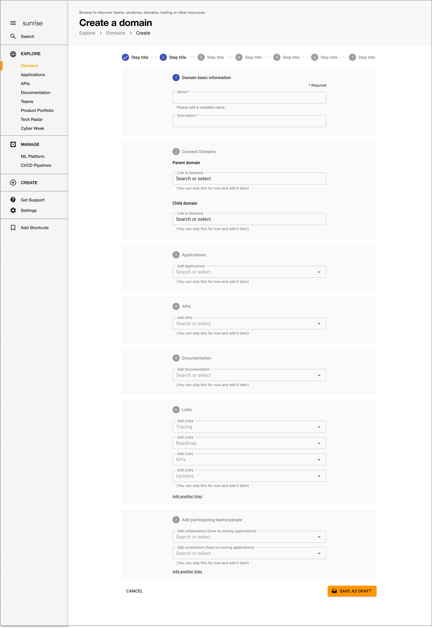
Scalable impact: The creation pattern became the platform standard — deployed across all resource types without per-team redesign work, saving weeks of design and engineering effort for each new tool integration.
API Linter Integration
The problem
The API Linter existed as a standalone tool with its own UI. Only ~15 power users used it regularly, despite API quality being a company-wide priority. The tool team wanted to maintain their own interface and roadmap independently.
The design decision
I argued for full integration into Sunrise rather than keeping it standalone. The business rationale: API quality standards only work if developers actually use the linter. Expecting developers to context-switch to a separate tool was a friction tax that most wouldn't pay. Integration meant the linter appeared in the workflow where developers already worked — right alongside their API definitions. The trade-off was additional engineering effort for the integration and some loss of the linter team's UI autonomy.
Theme 3: Operational Resilience
Cyber Week 2021 Start Page
Cyber Week is Zalando's biggest operational and financial event. I designed a dedicated start page that centralized critical tools, real-time status dashboards, and escalation paths — reducing context-switching during high-pressure periods and giving teams a single source of truth when every minute mattered.
Key Impact
Improved developer experience for 1800+ active builders — 72% rated the redesigned navigation as "significantly better"
Unified fragmented tools and services into cohesive platform experience
Reduced tool discovery time by ~40% and increased API Linter adoption from 15 to 56 active users through platform integration
Reduced onboarding time for new team members from 2-3 weeks to under 1 week through improved navigation and documentation
Key Takeaway
As the sole designer for a platform serving 1,800+ builders, I learned that the most impactful internal tooling design isn't about individual features — it's about creating coherent systems that reduce cognitive load across the entire developer journey.
The navigation redesign alone had more impact than any single tool improvement because it changed how builders related to the entire platform. By establishing consistent patterns (unified creation flows, standardized navigation, integrated tools), I helped shift the Builder Platform from a collection of separate tools to a platform that teams actually wanted to use — measurably improving discoverability, adoption, and developer satisfaction.
Outcomes & Next Steps
What changed: teams moved from a tool-by-tool approach to a clearer platform experience with stronger discoverability.
What scaled: reusable patterns for navigation, creation, and ownership reduced repeated UX debt in subsequent initiatives.
Next: deepen in-product guidance and cross-service consistency so first-time builders complete critical workflows with less support dependency.